Choosing the Best Colour Palette for Coastal Homes in Gordon’s Bay
Living by the sea has its perks—stunning views, fresh ocean air, and a relaxed lifestyle. But when it comes to painting your home in Gordon’s Bay, the coastal setting calls for thoughtful colour choices that both suit the environment and stand up to the elements.
In this guide, we’ll help you choose the best coastal colour palette for your home, so it looks beautiful, complements the natural surroundings, and lasts for years.
1. Understand the Coastal Aesthetic
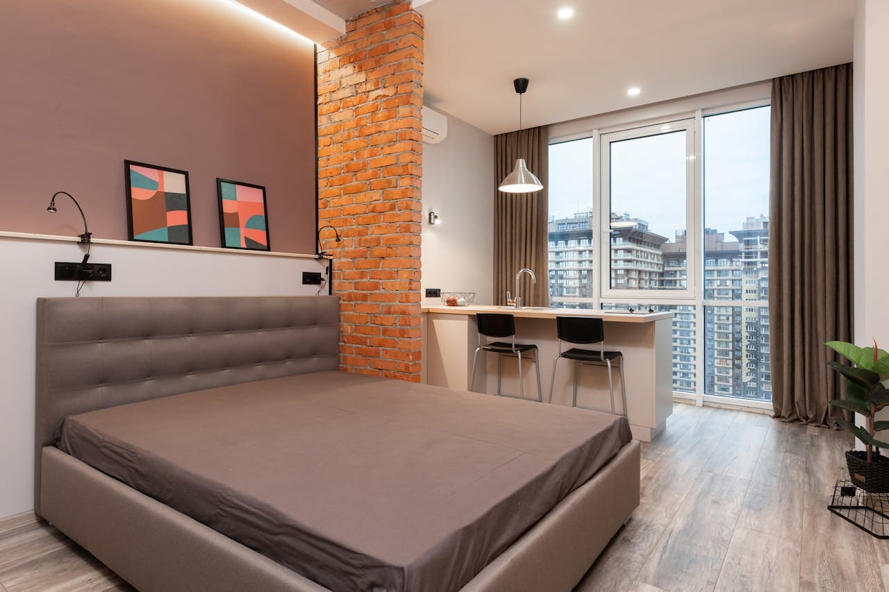
Homes in Gordon’s Bay often reflect a laid-back, beach-inspired lifestyle. Colours that work best tend to mirror the coastal landscape—think of the soft tones of sand, driftwood, and seafoam, or the bold blues of the ocean and sky.
Popular coastal-inspired tones include:
- Soft whites and creams for brightness and versatility
- Ocean blues and sea greens for a tranquil, fresh feel
- Sandy beiges and taupes for warmth and neutrality
- Muted greys that mimic weathered wood and rock
- Accent colours like navy, teal, or coral to bring character
2. Choose Colours That Withstand the Elements
Gordon’s Bay’s humid, salty air and strong sun can take a toll on exterior paint. Colours fade faster under UV exposure, and darker shades tend to show wear more quickly.
Top recommendations for coastal durability:
- Lighter shades resist fading better and reflect heat
- UV-resistant, marine-grade exterior paints are a must
- Satin or low-sheen finishes offer protection while reducing glare
At Fair Value Painters, we only use premium paint products that are specially formulated for coastal conditions.
3. Complement Your Home’s Style and Setting
The architectural style of your home should also guide your palette. Whether you live in a modern beachfront villa, a traditional coastal cottage, or a contemporary family home, colour should enhance—not fight—the home’s structure and surroundings.
Examples:
- Modern homes: clean whites, steel greys, navy accents
- Beach cottages: soft pastels, seafoam green, warm whites
- Family homes: neutral tones with bold door or shutter colours for contrast
If your home is surrounded by native vegetation or sea views, try to harmonize your palette with the natural tones of the landscape.
4. Don’t Forget the Details
Trim, shutters, doors, and roof lines are great places to add contrast or character.
- White trim adds a crisp, clean finish to almost any colour
- Darker doors (like charcoal or navy) make a bold statement
- Accent walls or features can add personality without overwhelming the look
Keep your palette to 2–3 main colours to avoid visual clutter and maintain cohesion.
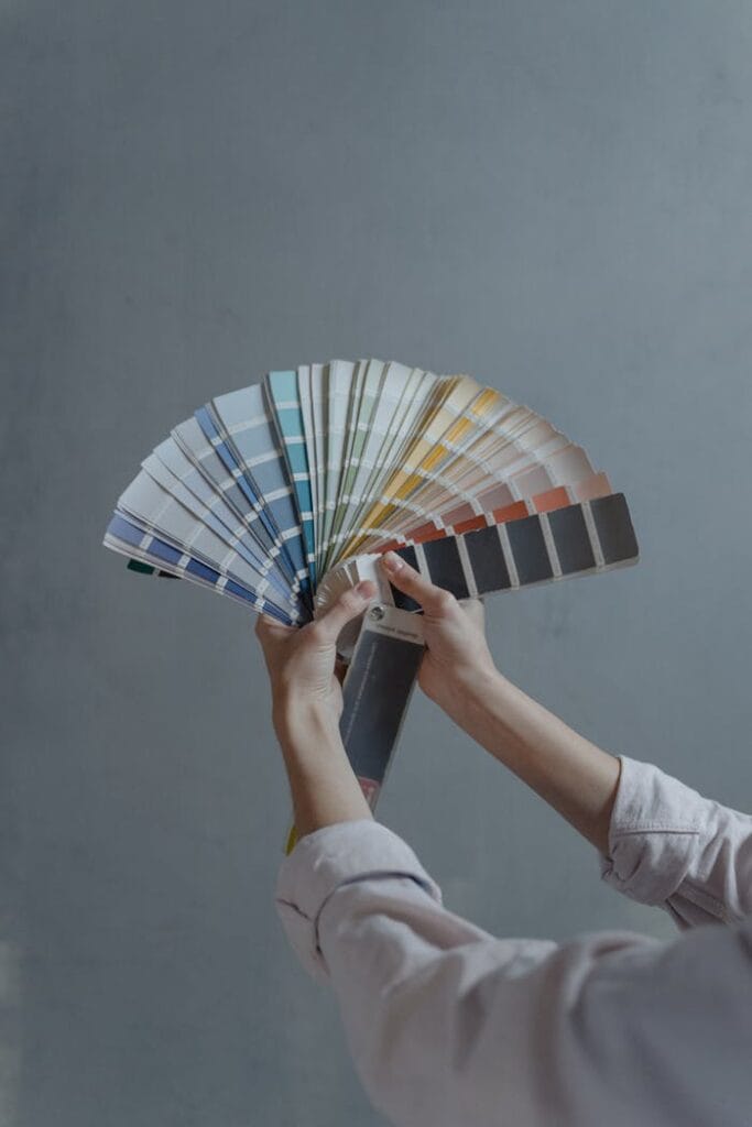
5. Get Expert Advice Before You Commit
Choosing the right palette is a big decision—one that you’ll live with for years. At Fair Value Painters, we offer in-home colour consultations for homeowners in Gordon’s Bay. We take into account your personal taste, lighting, neighbourhood trends, and weather conditions to help you find the perfect balance.
Plus, we provide sample testing so you can see how your chosen colours look in real lighting on your actual walls.
Let Your Coastal Home Shine
With the right paint colours, your Gordon’s Bay home can feel brighter, more spacious, and more inviting—while staying protected against coastal wear and tear.
Whether you’re refreshing your exterior or creating a soothing seaside-inspired interior, Fair Value Painters is here to help from start to finish.
📞 Call: 067 643 5319
📧 Email: nazeem@fvpainters.co.za
🌐 Visit: www.fvpainters.co.za